MAD GAME LAB ·
VISUAL IDENTITY
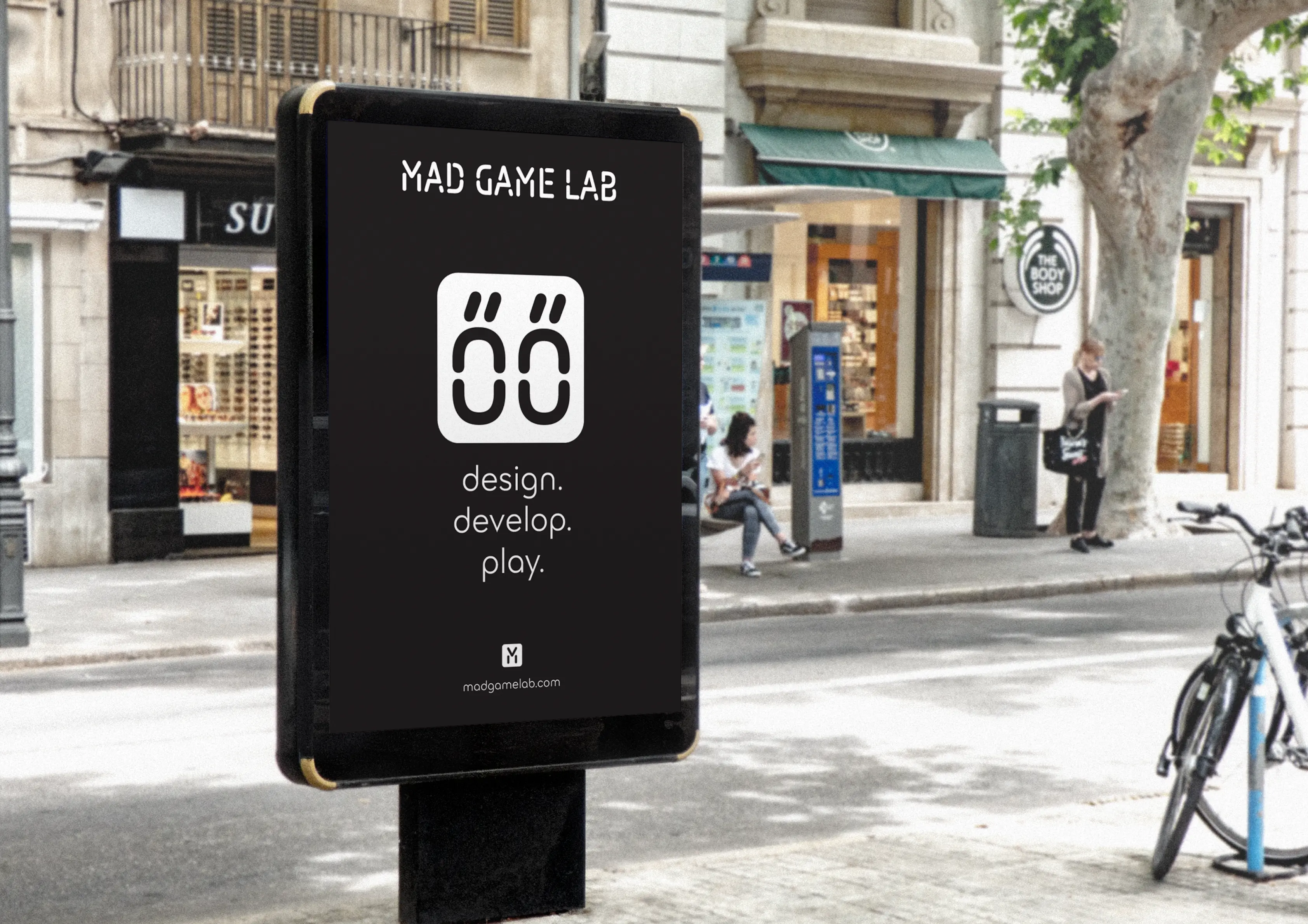
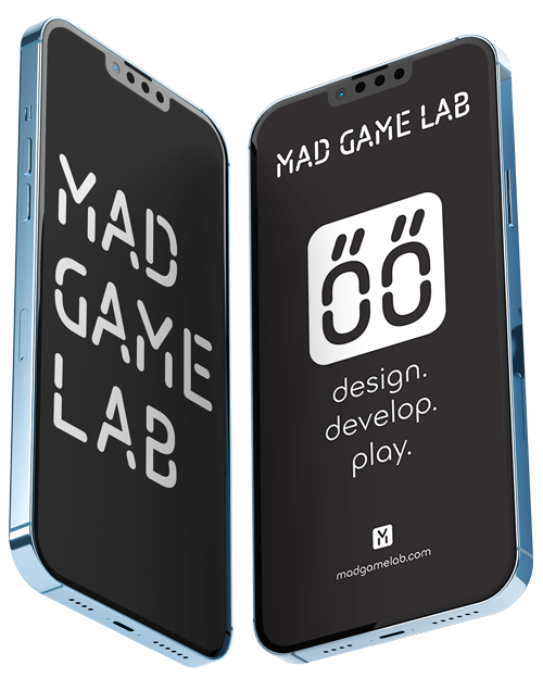
The visual identity of MAD GAME LAB embodies the creativity and diversity of the gaming world, adapting to market trends and evolving graphical experiences. Designed with a modern, versatile, and dynamic aesthetic, it maintains a minimalist approach that ensures flexibility across multiple contexts. This adaptable system allows the brand to evoke a wide range of emotions while staying true to its core identity, making it impactful across both traditional and digital platforms.
Role
Brand Designer
TEAM
António Amorim
Client
P.Porto
INDUSTRY
Gaming
TOOLS

DURATION
4 week


Distinctive Visual Style: Each game features a unique graphic style, but all opt for a minimalist or stylized approach rather than full realism. This enhances immersion, allowing the player to focus on the narrative and emotional experience.
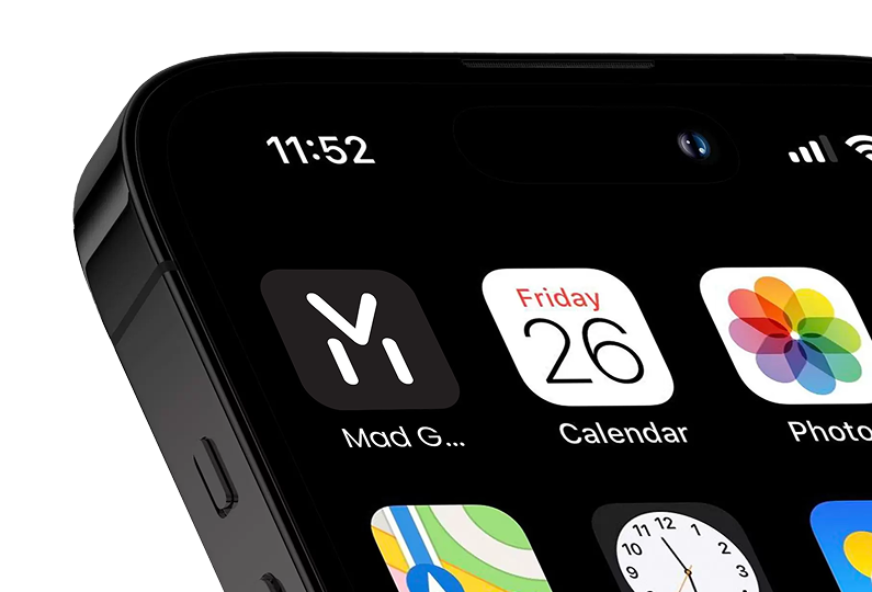
Simple and Iconic Visual Identity: With the exception of Zelda, they have simple logos. All feature fonts and styles that reflect their theme or visual aesthetic. This simplicity enhances recognition and makes each game’s visual identity strong and memorable.
Atmosphere and Emotion: There is a clear focus on creating a specific atmosphere, ranging from the mystery of Animal Well and Undertale to the contemplation of Journey. The graphics and visual environment not only serve the art style but also help establish the player’s emotional experience.
Consistent Color Palettes: All games use well-defined color palettes, whether vibrant and varied or more monochromatic and moody. These palettes help shape the visual identity, contributing to the overall tone and atmosphere.

The visual identity of MAD GAME LAB reflects the diversity and creativity associated with the world of video games, aligning with the constant evolution of the market and the various graphic experiences it offers. The core concept is built around a modern, versatile, and dynamic image, balanced by a minimalist approach that facilitates adaptation to multiple contexts and projects.
While the brand evokes a specific central emotion, it has the ability to convey a wide range of feelings and experiences through iconography that remains true to its original concept. This positioning allows the brand’s visual identity to function as a fluid system, transforming itself to reflect the unique characteristics of each project without compromising its essence.
The choice of a minimalist style does not limit the complexity of visual applications. On the contrary, this minimalism provides a solid and versatile foundation, ready to be reinterpreted across various platforms, color palettes, and visual atmospheres. This flexibility ensures that the brand’s identity remains equally impactful, whether in traditional formats such as print or in immersive and innovative digital environments.


The safety area is designed to ensure the readability and visual integrity of the composition. It must be strictly respected, prohibiting the insertion of any external elements, whether graphic or textual.
It is essential to ensure that all reproductions maintain the minimum dimensions of this area. The protected space should occupy half the height of the rectangle, and whenever possible, this area should be expanded to further preserve clarity and impact.


The logotype should be scaled up according to the need for readability from a great distance. There is no maximum size limit for its reproduction, as long as the proportions of the design and the surrounding safety area are strictly maintained.