
What’s the story behind?
Crafting “Hoot’s” Brand Identity
Over Christmas 2024, me and my friends at uni all ended up giving each other the same plush Hedwig and made her our mascot. Originally, I thought of calling this project “Owl,” but it lacked oomph. Inspired by the owl’s signature call, I went with “Hoot,” which perfectly suits a streaming service—think night-owl vibes, a playful invitation to explore, and a cool logo merging the two “O”s into an owl’s face.
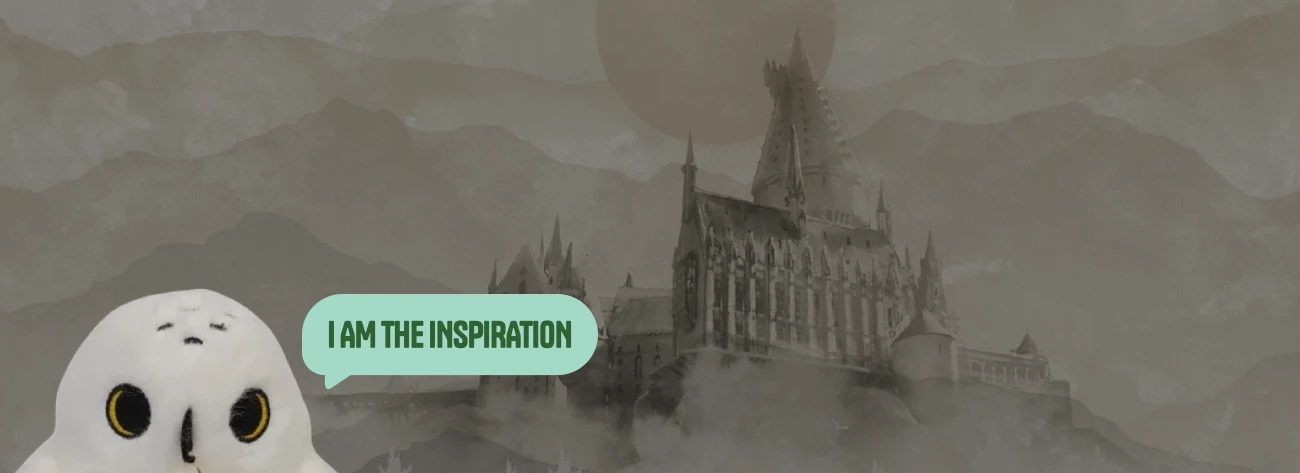
Moodboard
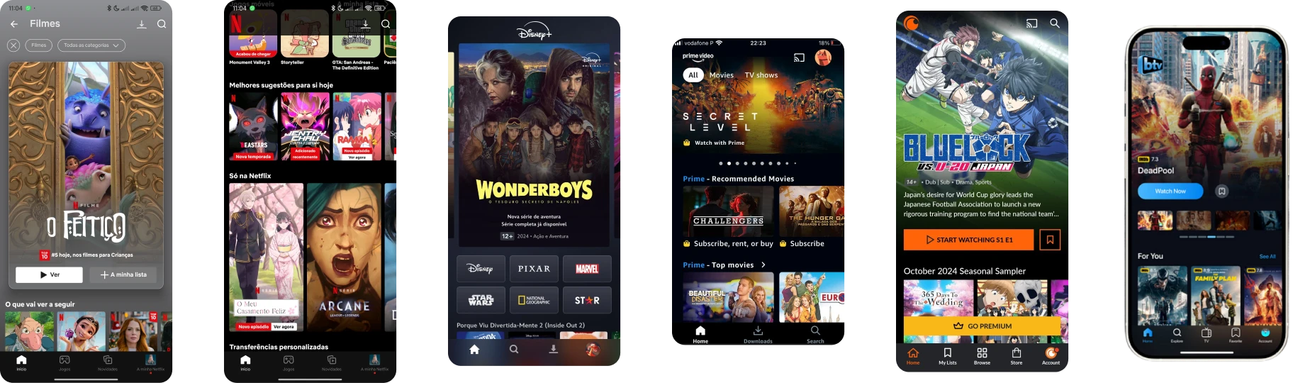
Drawing from Streaming Titans
Drawing inspiration from leading streaming platforms such as Netflix, Disney+, Prime Video, and Crunchyroll, this moodboard captures the essence of vibrant visuals, intuitive navigation, and cohesive brand identity. By examining their core design principles, I aimed to craft an engaging and immersive cinematic experience that resonates with modern audiences and elevates the overall user journey.
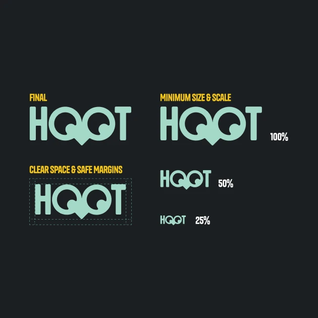
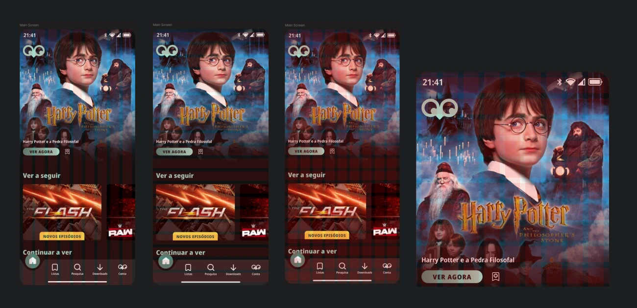
Final Version
Logo Integrity & Usage Guidelines
In this section, you will find the detailed specifications for our finalized logo, including essential clear space requirements, reduction scales, and proportional standards. These guidelines ensure that every representation of our brand is consistently aligned with our identity, maintaining visual cohesion and professional appeal across all platforms and media.
Iconography
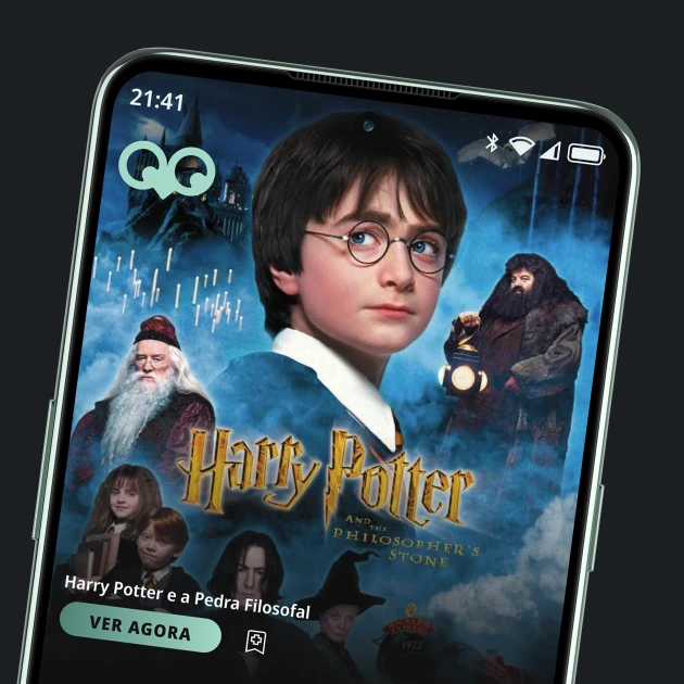
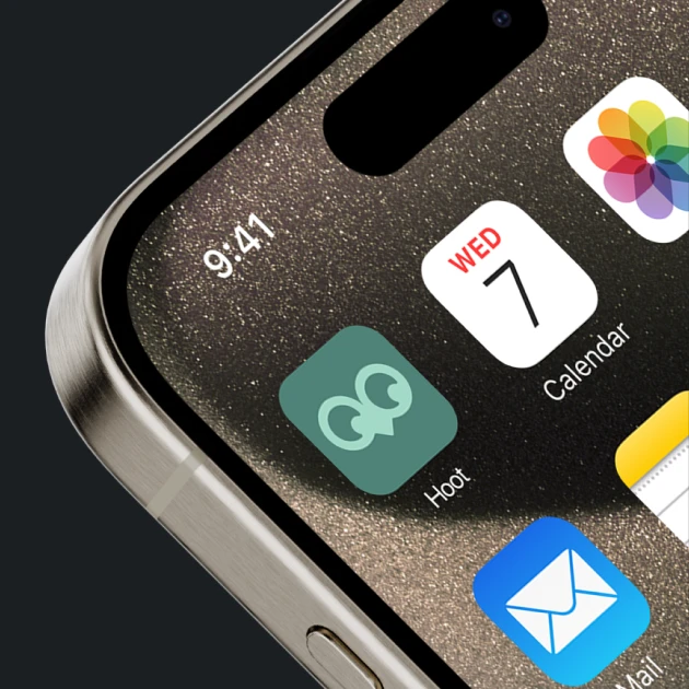
App Icon & In-App Iconography
Colors
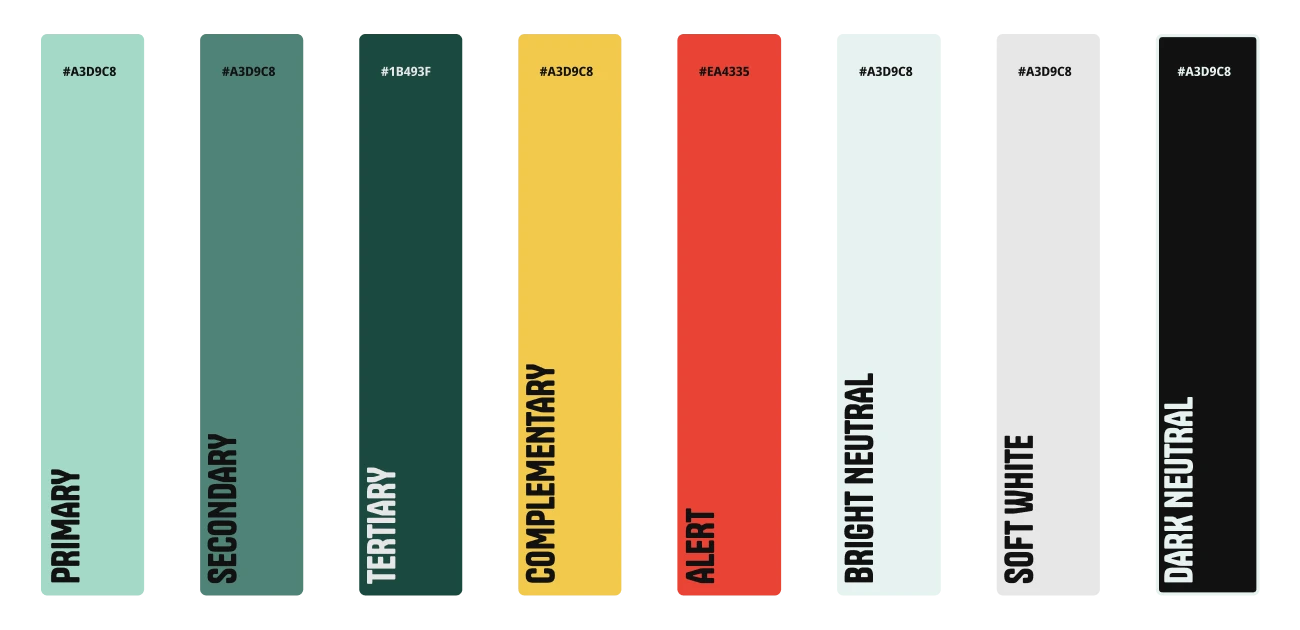
Color Palette & Visual Identity
The selected color palette defines the visual tone of the project, balancing aesthetics and functionality. The primary, secondary, and tertiary colors establish brand recognition and visual hierarchy, while the complementary and alert colors provide contrast and draw attention to key elements. Neutral shades ensure readability and balance, supporting a seamless user experience across different screens and interactions. This carefully crafted palette enhances accessibility, consistency, and emotional engagement.
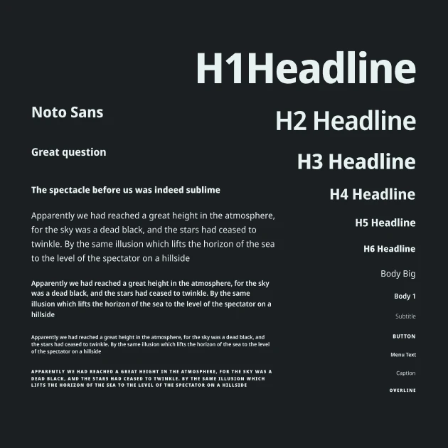
Typography
Typeface: Noto Sans
Noto Sans is a versatile, open-source sans-serif typeface developed by Google. Designed to provide harmonious support for over 1,000 languages and 150 writing systems, it ensures consistent visual presentation across diverse linguistic contexts.
In this brand, Noto Sans serves as the primary typeface, chosen for its clarity, neutrality, and global applicability. Its clean and modern aesthetic enhances readability, making it ideal for both digital and print media. The uniform stroke thickness and unmodulated design contribute to a cohesive and professional appearance.
Low-Fidelity Wireframes
Enhancing Clarity and Communication
Developing wireframes allowed me to visualize and refine the layout and structure of the project early in the design process. This approach facilitated clear communication of design intentions, ensuring that the foundational elements aligned with the project’s objectives.
Incorporating wireframes into this project was a strategic decision to establish a solid design foundation, promote efficient workflows, and prioritize user-centric solutions.
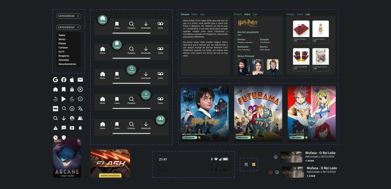
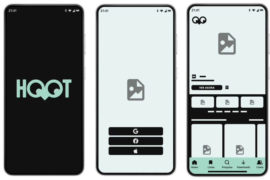
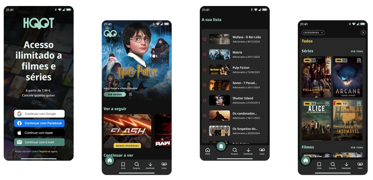
High-Fidelity Wireframes
Achieving Precise Design Representation
Developing high-fidelity wireframes allowed me to create detailed and realistic representations of the final product. This precision ensured that all visual elements, including typography, color schemes, and content placement, were meticulously planned and aligned with the project’s objectives.
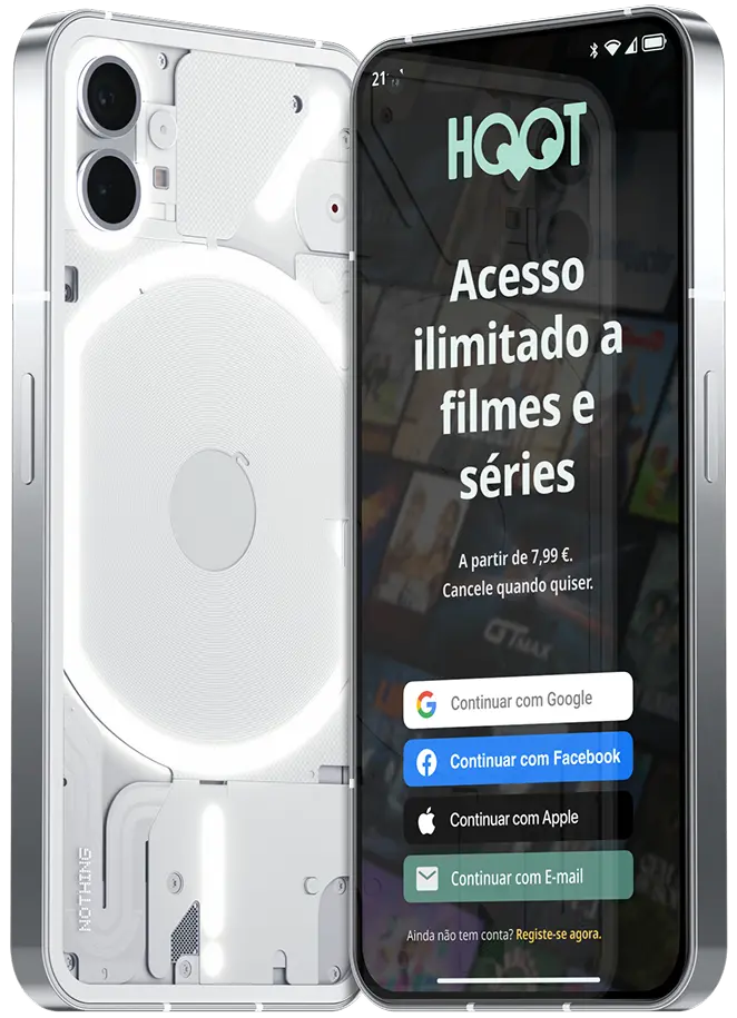
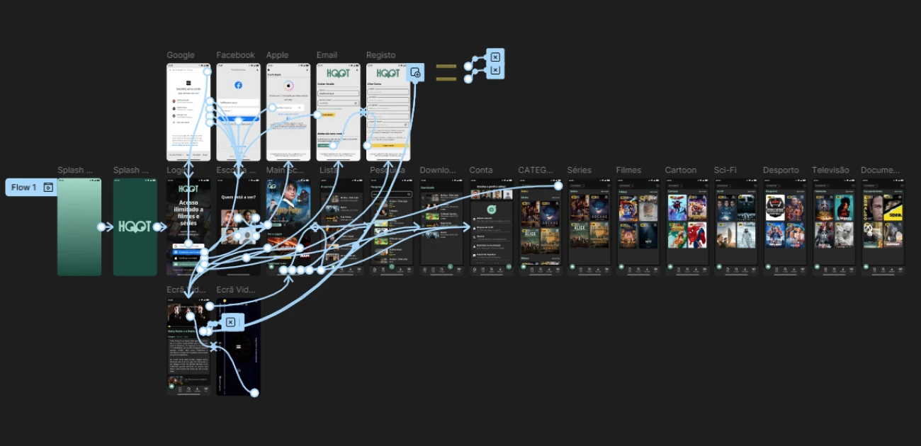
Prototype
Prototype & Interaction Design
Creating an interactive prototype was essential to testing and refining the user experience. By simulating real interactions, I validated navigation flows, user behaviors, and responsiveness. This step ensured a seamless and intuitive interface, allowing for quick iterations based on feedback and usability insights.
Grids
Establishing Structural Harmony
Incorporating both vertical and horizontal grids allowed me to create a balanced and organized layout, ensuring that all design elements are cohesively aligned. This structure facilitates a seamless visual flow, enhancing the user’s ability to navigate and comprehend the content effectively.
Design System
Simplifying development workflows
Components are designed with multiple variants for flexibility and consistency, while a cohesive icon set ensures visual harmony. Subcomponents break down complex elements into reusable parts, enhancing modularity and ease of maintenance.